
Every email design follows a similar structure as each element fulfills a role in achieving visual hierarchy like shown below.
Right at the top is the pre-header text in a font color fading into the background, a link to view the email in browser and followed by the brand logo. Yet, programmatically the subscriber first sees the brand logo; then the eye scan pattern moves down towards the navigation menu and finally onto the hero image and then the email copy.
Owing to the low human attention span, every email marketer tries to direct the focus of the subscriber to the email copy as soon as they open the email. While that is easily achievable in desktop layout as most of the content is present in the first fold itself, the subscriber viewing the email in mobile device will have a bad user experience if the email renders as either of the below instances.
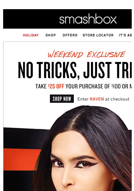
Fig 1.The email is non-responsive, so the subscriber will have to scroll horizontally & vertically to see the entire email.
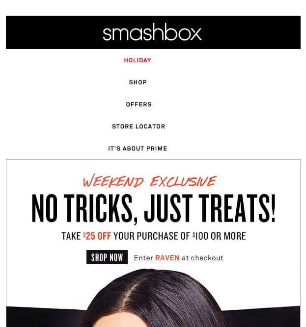
Fig 2. The responsiveness of the email stacks the navigation menu vertically, pushing the content further down.
As you can see, with the navigation menu consuming a major real estate space in the email, the subscriber must scroll down to read the actual email. As we discussed about How REI ‘served’ Hamburger Menu in emails, Monks here showcase another example of how Smashbox hid its navigation menu behind an interactive Hamburger Menu in Emails to reduce email content length.
This way, those interested can check out other products via the navigation menu by clicking the menu on the top and rest of the subscribers can move forward with the email.

Now let’s observe the transition of how they came to Let’s understand how adventure gear retailer REI clothing implemented hamburger menu in their emails over the years.
Journey From a Responsive Email to Menu Enabled Microsites
2015 – No Implementation of Navigation Menu in Emails
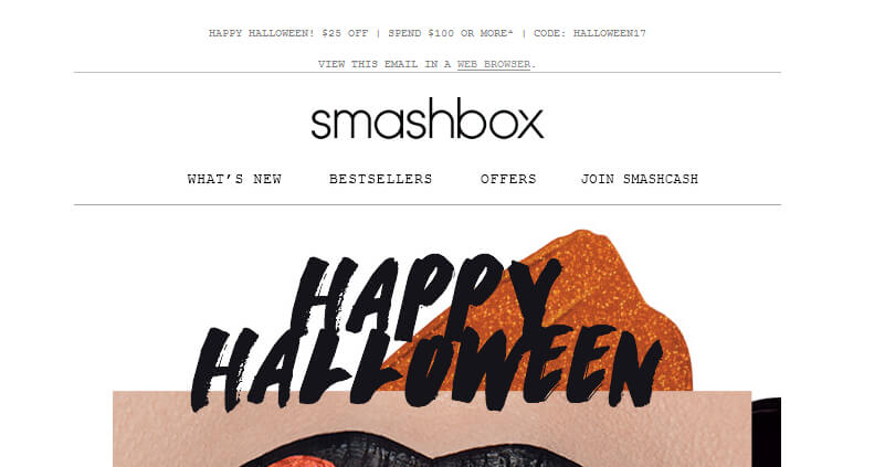
Earlier, emails were mainly opened on desktop devices. In 2009, the need for responsive emails pick up the pace as people started opening emails more frequently in mobile devices. Smashbox’s 2015 email was a beacon stating that their first step into the mobile responsive domain.
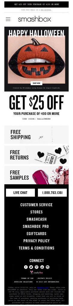
In one look you find that Smashbox has a navigation Menu on the top of their email, where the subscriber is free to click and be redirected to a corresponding page on the website.
2016 – Menu in Emails
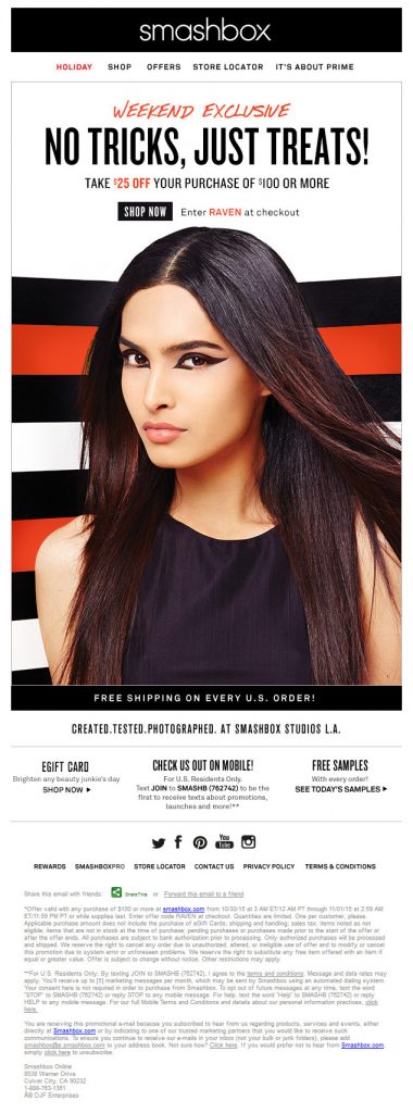
2016 was the year when Smashbox metamorphosed their emails to a minimal and cleaner look. By making use of the Hamburger menu in their emails, the navigation menu was hidden and the user had the freedom to interact with it to be redirected to the required page.
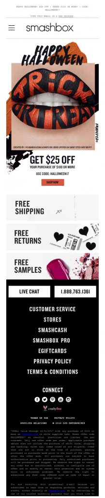
2017 – Menu in Emails
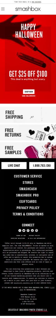
2018 – Menu in Emails
Advantages of Menu in Emails
- A dropdown Menu optimizes the layout for on-the-go viewers.
- Navigation Menu in email is usually hidden (in plain sight) for mobile layout, nobody is forced to engage with it. This way only those interested shall interact with it.
- The subscriber needs to be driven to the actual email copy. Since the Navigation Menu is hidden, everyone, scanning the email, won’t need to scroll after opening the email to read the email copy.
How EmailMonks can help
Interactivity in email is achieved using CSS animation and may not be supported in some email clients. After extensive testing, Android and Apple native email clients renders Hamburger menu very well and only Windows-based mobile clients are not supporting. Our development team test all email templates across 40+ email clients before delivery.
Looking to integrate Navigational Menu in your next Email Campaign? Get in touch with our experts.
No comments:
Post a Comment