
We, the Monks, love to design emails as well as share insightful blogs across different topics that are a part of email marketing domain.
And based on the tremendous response we got from you patrons, Monks reflect on the top blogs that you have loved in the year gone by.
Envisioning Top 7 Email Design Trends for 2018
The glorious year 2017 has finally approached its end. The email marketing domain has gone through loads of Ups and Downs and what better way to kickstart 2018 than finding out the design trends that Monks are expecting to see.

Click on the banner to guess our email design trends for 2018
Mailable Microsites Series: Navigation Menu
Mailable microsites are the next big thing for sure as far as email marketing is concerned. Gradually, brands have been introducing interactive elements in their promotional emails, which only function when the subscribers interact with the elements. In this blog , Monks have analyzed on how REI managed to integrate navigation menu in their emails in order to reduce the overall length of their emails.
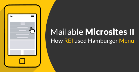
Click on the banner to know how REI ‘served’ the Hamburger Menu with a side of relish
DIY Navigation Menu and Carousel Tool
This is an age of people following DIY tutorials to create something with easy to use instructions. Following the great number of downloads clocked for menu, carousel, countdowns, etc. in 2017, this is a blog highlighting our new tool to create really interesting interactivity and copy the generated code in your email to implement the magic of interactive menu or carousel.
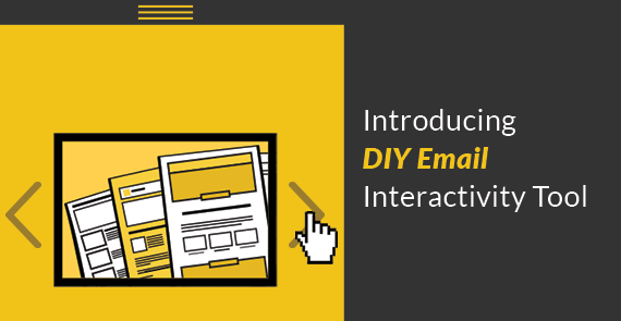
Click on the banner to check out to interact with our Interactivity tool
Spam Filter – Email Design & Coding Perspective
Any email marketer’s worst nightmare is simply the fear of their strategically designed email being blocked by SPAM filters. Filtering done by ISP can be based on the hotwords in email copy as well as overlooking of certain design pitfalls. This article focuses on the commonly overlooked design flaws as well as certain design taboos that raise red flags for ISPs.
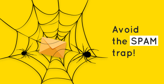
Click on the banner to free your emails from nasty SPAM trap laws
Changing from <Div> to <Table> in Emails – Myths & facts
Outlook has been the handicap for most email marketers, preventing them from dishing out really interesting email designs, thanks to <table> layout. But this has been a thing of the past with different email clients having better code support. This article is the result of the discussions going on regarding the pros and cons of using <div> instead of <table> layout and it busts certain myths that email developers believe about the use of divs.

Click on the banner if you feel that this caption looks better in div than table
Hero images / Visual hierarchy in emails
Human brain processes and retains information from images faster than text and so it is important to take into consideration the position, orientation and size of the visuals. This article uses email examples from different brands and demonstrates how they nailed it with visual hierarchy.
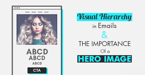
Click on the banner if you saw the image before reading the text in the banner
Gamification in Emails – Examples & Compatibility
Everyone loves immersive experience especially when they get to interact with certain elements in email. By using CSS3 interactivity as well as keyframe animations, brands have managed to include small games into emails and this article showcases such emails.
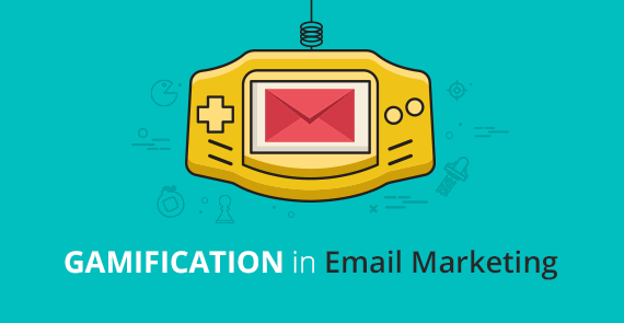
Click on the banner if you are reminded of a game console you own(ed)
10 Dos and Don’ts of Alt-text in Emails
Statistics state that 62.9% of brands always use ALT text for the images in their emails but there are certain dos and don’ts to be taken into consideration. Monks have compiled 10 such points and presented them in this blog.

Click on the banner if you wish to learn the best practices in Alt-text
Why a Welcome Email Series is Better Than Just One
On subscribing, 74.4% of consumers expect a welcome email. Receiving a welcome email makes them more receptive to the information you have to offer at the initial stage. But then comes this dilemma of opting for a single welcome email or a welcome series which is addressed in this blog.

Click on the banner to find out whether welcome series is better than welcome email
How Thank You Emails Can Help Increase Engagement
Another most opened email in the subscriber lifecycle is the Thank You email as it helps forge a relationship with your prospects. This blog explores the possibilities of when to send a ‘Thank You’ email, how brands are thanking their subscribers, and tips to make your Thank you emails more effective.

Click on the banner to learn if thank you emails increase engagement
How to Personalize Emails beyond the ‘First Name’
Email marketers tend to send ‘personalized’ emails by referring their subscribers with their first name. But with technology progressing by leaps and bounds, it is possible to improve the personalization game with more customer touchpoints. This blog peeks into how to personalize emails beyond “First Name”.

Click on the banner for us to address you better than just your first name.
The FIRST EVER Horror Email in the Inbox – Creating an eerie ‘Experience’
One of the multiple feathers in our hat, EmailMonks had created an email with keyframe animation and background sound to replicate the horror of Annabelle: Creation right in your inbox. Check out the compatibility and advantages of using keyframe animation in emails.

Click on the banner to check whether you are afraid of Annabelle
Take Interactivity to the Next Level with Kinetic Email Design
Previously, when email clients such as Apple Mail had robust modern HTML and CSS support and majority of other email clients didn’t, designers had to code emails for the lowest common denominator. But this didn’t eliminate the fact that brands are still sending kinetic emails to subscribers and this blog points out how brands have been using kinetic email designs.

Click on the banner if you feel that kinetic emails need to happen more in near future
Minimalist Email Design – A Timeless Style You Must Embrace
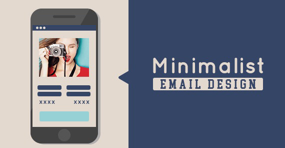
Click on the banner if you approve this minimal message
Minimalism has been a craze since long. The attention span of a regular human has been reduced and so brands are in the run for explaining a lot using less elements. This blog explores emails that are minimalist yet have conveyed the message effectively.
Cinemagraph GIF – Glam Up Your Email Campaign
GIFs have been a level above static images and Cinemagraphs can said to be a level above animated GIFs. This blog talks about how cinemagraphs are special, how brands have been using cinemagraphs, and how you can include one in your email. Worth reading if you wish to be spellbound by subtle yet powerful visual animations.

Click on this banner if you can see the clapper move
No comments:
Post a Comment