How good are you at building an email newsletter?
All of us read these theoretical articles about the mass mailing secret tips and tricks. But what about a little practice training? Time to check your knowledge!
Please keep in mind that some of the newsletters have been specially changed to test you. Don’t fall for the ruse.
Let’s start!
-
What is wrong with this part of the Wag newsletter?
The answer is under this image.
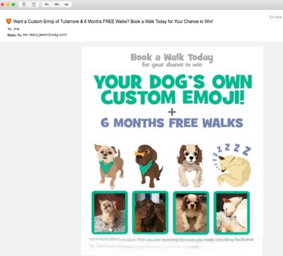
The hint: look at the “from” address.
The answer: ![]()
“Don’t bother us, we aren’t interested in your thoughts” ㅡ this is what you tell people by sending the newsletter from the “noreply” address.
Why no-reply email is not good for business?
The sender address is not only a part of your brand image, but also an opportunity to unsubscribe from newsletters.
Many servers handle replies, unsubscriptions, and spam complaints. Thus they are set to send emails from “noreply” senders to the spam folder.
So, using this type of email has a negative impact on:
- Email subscribers’ loyalty,
- Sender’s reputation.
-
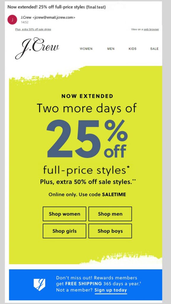
Try to find the email marketer’s mistake here:
No hint, it’s easy
The answer:
![]()
This mistake won’t lead ESP to send your email to the junk folder. Anyway, pay attention as it is a key engagement factor of your campaigns.
At times marketers do mistype in the email subject line to attract the attention of recipients. But, please note that people tend to remember the bad. So this can affect the reputation of your newsletters in the eyes of the recipient.
-
Pay attention to this e-newsletter design
Find the main mistake here:
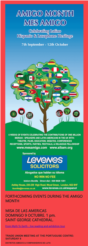
The hint is in the subheading.
The answer:
![]()
Don’t you find it difficult to find the main focus in this content? It looks unprofessional.
Even the poorest font design could be improved with the proper accents. There are two simple rules disrupted here. Don’t forget them:
- Use 2-3 main color scheme,
- Keep an eye on its compatibility and relevance to your brand image.
-
Try to find why we’ve included this cool email in the “mistakes” list
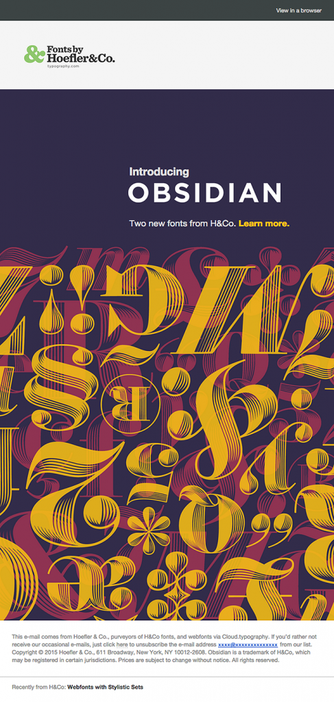
The hint: it’s in the visual part.
The answer:
![]()
Image-based newsletters look cool until it is opened where the the email client blocks newsletter illustrations. So if you don’t want your recipients to see the blank list instead of the bright content you want to show them, keep the image-text harmony.
This will help you:
- To prevent the HTML-to-text ratio spam problem,
- To make the newsletter content clear for the reader, regardless of whether the images are present or not.
-
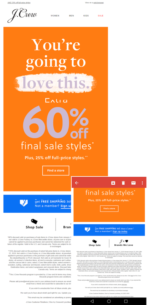
Any ideas why this J.Crew email campaign here?
The hint: sorry, not this time.
The answer: ![]()
Can you read the lower part of the text in the mobile version of this newsletter? I can’t. Moreover, it is a real challenge for mobile users to find the unsubscribe link.
-
What is the disadvantage of this example?
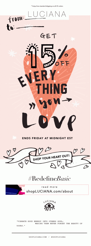
The hint: imagine your actions when you are irritated with this email.
The answer: ![]()
First of all, it is violation of GDPR restrictions and that can cost you business. Allow subscribers the freedom of choice or be ready to see all the efforts you put on the designing cool email in the spam folder.
Never forget to add this link to the content of your campaigns.
-
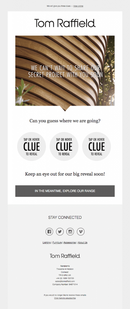
The last challenge: What is wrong with this newsletter?
The hint: recover in mind all the errors of previous examples.
The answer:![]()
Didn’t find? Me too.
Don’t be upset. You had no chances because there are no fails in this newsletter. It is perfect.
Time to summarize the results
Congrats! You did it. Thanks for your time.
We asked you to remember all the mistakes you noticed in these e-newsletters of this test, not for a joke or fun.
Keep them in mind for the future and avoid in real practice.

No comments:
Post a Comment